Cesar Hidalgo, Edward Tufte and data visualisation
The economy is too complex to understand - this doesn’t stop central bankers and politicians from yanking all the levers in their reach but does their interference achieve the desired goals? How can we understand the world?
https://cesarhidalgo.com/platforms
from Tim Harford’s tedtalk
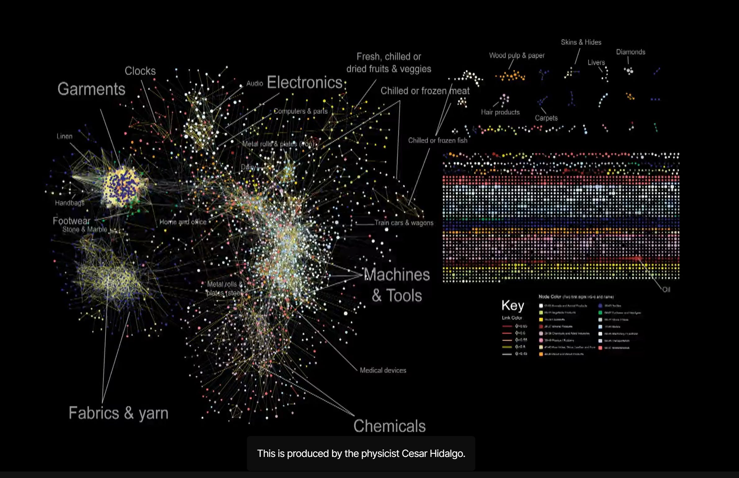
https://en.wikipedia.org/wiki/C%C3%A9sar_Hidalgo#The_Observatory_of_Economic_Complexity_(OEC)
see also https://brill.com/view/journals/rdj/5/1/article-p50_50.xml?language=en
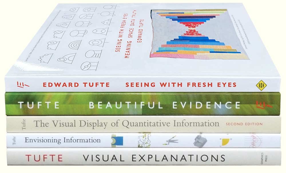
https://www.edwardtufte.com/tufte/
What is Tufte's first rule of data Visualisation?
“Above all else, show the data.” — Edward Tufte
Edward Tufte’s Feynman diagrams
https://www.edwardtufte.com/bboard/q-and-a-fetch-msg?msg_id=0003oo
Tufte
What the authors are saying here, in the Review's earnestly diplomatic language, is that bullet outlines can make us stupid: In every company we know, planning follows the standard format of the bullet outline... [But] bullet lists encourage us to be lazy in three specific, and related ways. Bullet lists are typically too generic. They offer a series of things to do that could apply to any business.... Bullets leave critical relationships unspecified. Lists can communicate only three logical relationships: sequence (first to last in time); priority (least to most important or vice versa); or simple membership in a set (these items relate to one another in some way, but the nature of that relationship remains unstated). And a list can show only one of those relationships at a time.2 MEDIAN NUMBER OF ENTRIES IN DATA MATRICES FOR STATISTICAL GRAPHICS IN VARIOUS PUBLICATIONS, 2OO3 Science > 1,000 Nature > 700 New York Times 120 Wall Street Journal 112 Frankfurter Allgemeine Zeitung 98 New England Journal of Medicine 53 The Lancet 46 Asahi 40 Financial Times 40 Time 37 The Economist 32 Le Monde 28 28 textbooks on PowerPoint presentations (1997-2003) 12 Pravda (1982) 5 Here is a graphic from Pravda (May 24, 1982), in the low-content, high-Phluff style now emulated by PP templates: Additional evidence on data matrices for various publications, including Pravda, is reported in Edward R. Tufte, The Visual Display of Quantitative Information (1983, 2001), p. 167. In this table above, the medians are based on at least 20 statistical graphics and at least one full issue of each publication. Except for scientific journals, most of these publications use standard formats issue after issue; replications of several of the counts above were within 10% of the original result. 2 Gordon Shaw, Robert Brown, Philip Bromiley, "Strategic Stories: How 3M is Rewriting Business Planning," Harvard Business Review, 76 (May-June, 1998), pp. 42-44- By leaving out the narrative between the points, the bullet outline ignores and conceals the causal assumptions and analytic structure of the reasoning. In their Harvard Business Review paper on business planning, Shaw, Brown, and Bromiley show that even simple one-way causal models are vague and unspecified in bullet outlines. And more realistic multivariate models with feedback loops and simultaneity are way over the head of the simplistic bullets: Bullets leave critical assumptions about how the business works unstated. Consider these major objectives from a standard five-year strategic plan: • Increase market share by 25%. • Increase profits by 30%. • Increase new-product introductions to ten a year. Implicit in this plan is a complex but unexplained vision of the organization, the market, and the customer. However, we cannot extrapolate that vision from the bullet list. The plan does not tell us how these objectives tie together and, in fact, many radically different strategies could be represented by these three simple points. Does improved marketing increase market share, which results in increased profits (perhaps from economies of scale), thus providing funds for increased new-product development? Market share Profits New-product development Or maybe new-product development will result in both increased profits and market share at once: -»• Market share New-product development Profits Alternatively, perhaps windfall profits will let us just buy market share by stepping up advertising and new-product development: Profits > New-product development > Market share3 Bullet outlines might be useful in presentations now and then, but sentences with subjects and verbs are usually better.
Richard Feynman had also experienced the bullet-outline format style of NASA in his service on the commission that investigated the first shuttle accident, the Challenger in 1986. Feynman wrote: Then we learned about "bullets"—little black circles in front of phrases that were supposed to summarize things. There •was one after another of these little goddamn bullets in our briefing books and on slides.6 For some scientists and engineers, Feynman might serve as the decisive authority on this matter. Indeed, for those who have read Feynman's books, a good way to try to think clearly about evidence and explanation is to ask "What would Feynman do?"
Sometimes PowerPoint's low resolution is said to promote a clarity of reading and thinking. Yet in visual reasoning, art, typography, cartography, even sculpture, the quantity of detail is an issue completely separate from the difficulty of reading. Indeed, at times, the more intense the detail, the greater the clarity and understanding—because meaning and reasoning are contextual. Less is a bore.
A better metaphor for presentations is good teaching. Teachers seek to explain something with credibility, which is what many presentations are trying to do. The core ideas of teaching—explanation, reasoning, Finding things out, questioning, content, evidence, credible authority not patronizing authoritarianism—are contrary to the hierarchical market-pitch approach. Especially disturbing is the introduction of the PowerPoint cognitive style into schools. Instead of writing a report using sentences, children learn how to make client pitches and info-mercials, which is better than encouraging children to smoke
https://www.inf.ed.ac.uk/teaching/courses/pi/2016_2017/phil/tufte-powerpoint.pdf
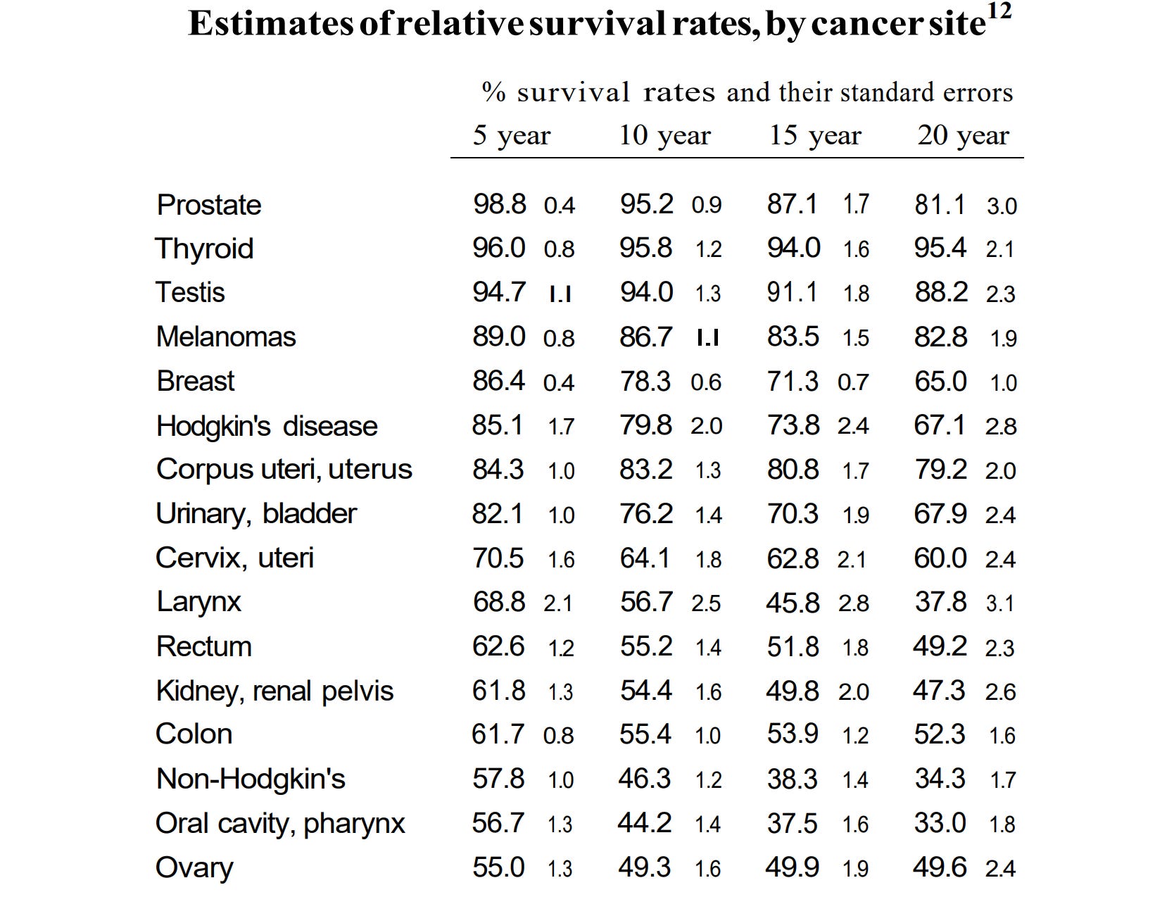
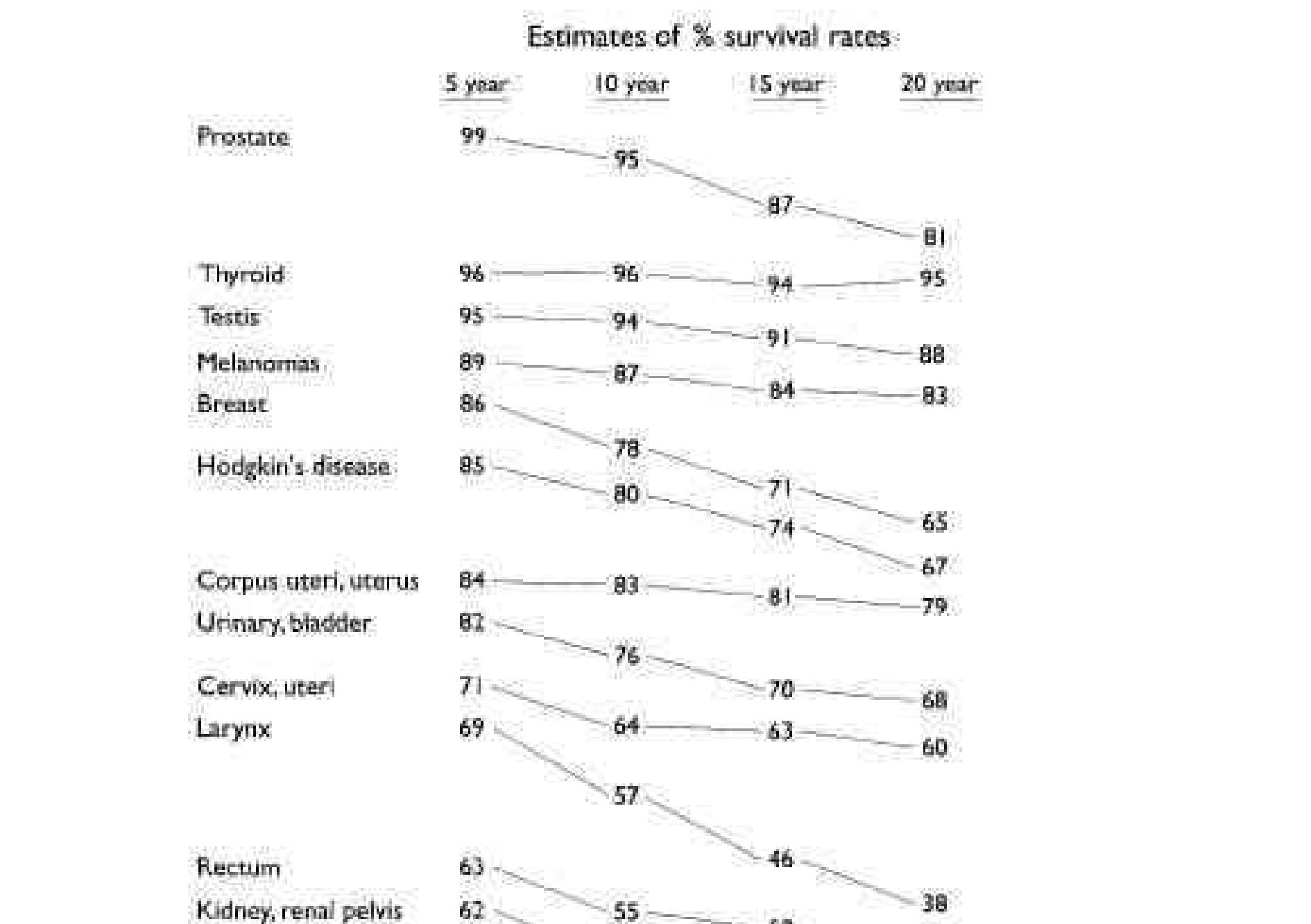
Tufte on cancer
Obnoxious transitions and partitions occur not only slide-by-slide but also line-by-line. We have seen the problems with the bullet list. Worse is the method of line-by-line slow reveal (at right). Beginning with a title slide, the presenter unveils and reads aloud the single line on the slide, then reveals the next line, reads that aloud, on and on, as stupefied audience members impatiently await the end of the talk. It is helpful to provide audience members with at least one mode of information that allows them to control the order and pace of learning— unlike slides and unlike talk. Paper handouts for talks will help provide a permanent record for review—again unlike projected images and talk. Another way to break free of low-resolution temporal comparisons is to show multiple slides, several images at once within the common view. Spatial parallelism takes advantage of our notable capacity to reason about multiple images that appear simultaneously within our eyespan. We are able to select, sort, edit, reconnoiter, review—ways of seeing quickened and sharpened by direct spatial adjacency of evidence. Now and then the narrow bandwidth and relentless sequencing of slides are said to be virtues, a claim justified by loose reference to George Miller's classic 1956 paper "The Magical Number Seven, Plus or Minus Two." That essay reviews psychological experiments that discovered people had a hard time remembering more than about 7 unrelated pieces of really dull data all at once. These studies on memorizing nonsense then led some interface designers to conclude that only 7 items belong on a list or a slide, a conclusion that can only be reached by not reading Miller's paper. In fact the paper neither states nor implies rules for the amount of information to be shown in a presentation (except possibly for slides consisting of nonsense syllables that the audience must memorize and repeat back to a psychologist). Indeed, the deep point of Miller's work is to suggest strategies, such as placing information within a context, that help extend the reach of memory beyond tiny clumps of data.16
https://www.inf.ed.ac.uk/teaching/courses/pi/2016_2017/phil/tufte-powerpoint.pdf
TUFTE: The great, big thing is to try to devote most of one's brain-processing power to the seeing. That is, as we know from all the studies of cell phones and driving automobiles, people don't do very well in seeing where they're going when they're talking. And so deep seeing requires a fairly certain serenity of one's self, but also a serene environment. And in that way, all the brain's processing power can veto into seeing.
The - that's why I call it "The Thinking Eye." In some ways, seeing is thinking. The light comes in through the lens and is focused on the retina. And the retina is doing - is pretty much working like brain cells. It's processing. And then the two optic nerves are sending what we now know are 20 megabits a second of information back to the brain. That's sure a lot better than my Wi-Fi at home.
And so the seeing right then is being transformed into information, into thinking, right as that step from the retina to the brain. And the brain is really busy, and it likes to economize. And so it's quick to be active and jump to conclusions. So if you're told what to look for, you can't see anything else. So one thing is to see, in a way, without words. That avoids the confirmation bias, where, you know, that once you have a point of view, all history will back you up.
I think probably the best visualization ever are Feynman diagrams. They show nature's subatomic behavior. They've been used for 70 years by scientists, and they've thankfully replaced a lot of hairy mathematics.
I wrote a manuscript, and I showed it to Bob Merton, the great sociologist. And he wrote on the margin that this was an echo of some very famous work. I did not take that as a particular compliment. I took that as telling me: play in the big leagues.
And what that meant to me was to be like, in a way, like science, which - the findings of which are forever, because the laws of nature apply to every particle in the universe forever. And so knowledge about that is, in a sense, forever knowledge. And though I wanted to stop worrying about this quarter's latest journal of whatever it was, or what's - what is topical or what's in The New York Times this week, I wanted to do things that have that universality and forever-ness of science.
And so I've been ever since preoccupied with how the fundamental tasks of thinking can be replicated in our designs of information, so that our architectures support learning about causality - that's a forever cognitive task - support, that our architectures support making comparisons, which is a fundamental forever task.
LICHTMAN: What about Steve Jobs? What do you think of the approach that he took towards design?
TUFTE: I think it was extraordinary. His approach was different from everyone else's, which is to start with the user experience, and work backwards to the technology. I always, in - likewise in my own work, I'm really indifferent to the methodology of producing visualizations, and all I care about is relationship between the viewer's brain and the intellectual tasks and the material at the - as it's presented.
LICHTMAN: Is there a data that - sorry - is there a data that can't be visualized well?
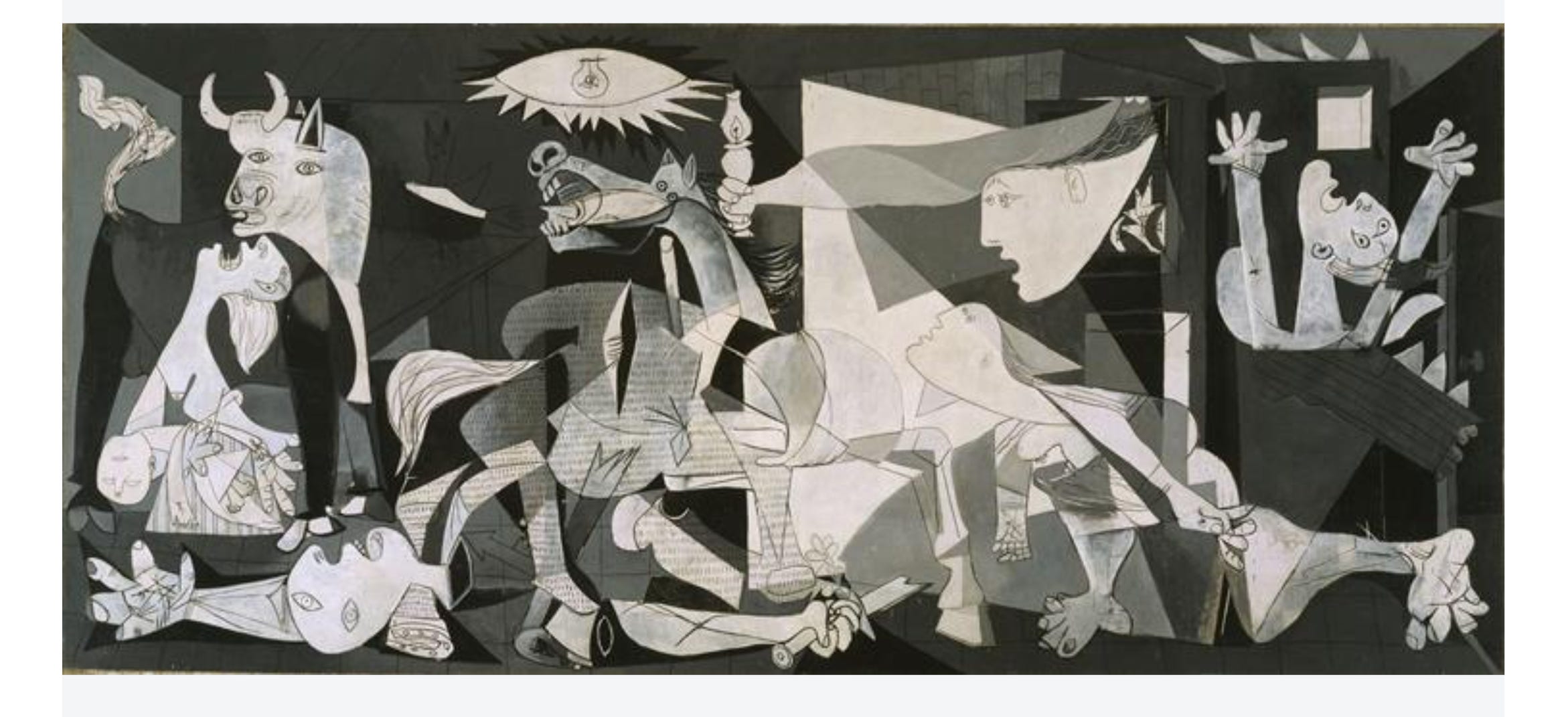
TUFTE: The kinds of more subtle, emotional, grander, symbolic things. But for those kinds of things, I think art does very powerfully. I mean, I think, of course, of Picasso's "Guernica," one of the, you know, best few paintings of the 20th century and probably the best thing about the horror of war ever done, the unspeakable horror of war. But there it is in "Guernica."
https://www.npr.org/2013/01/18/169708761/edward-tufte-wants-you-to-see-better
Norvig Gettysburg address powerpoint
https://norvig.com/Gettysburg/index.htm
on the Tube map https://www.edwardtufte.com/bboard/q-and-a-fetch-msg?msg_id= 00005W
on Steve Ballmer https://www.edwardtufte.com/bboard/q-and-a-fetch-msg?msg_id=0003RO
on powerpoint
Mathematics. in the way that the graph of a function approaches an asymptote, a straight line representing the limit of the function as one of its variables grows to infinity:This curve has a characteristic bell shape, high in the center but asymptotically approaching zero to form a tail on either side.
in an asymptotic way; in such a way as to approach a given value, point, level, etc., continuously without ever reaching it:He applies similar reasoning to the problem of the moral perfectibility of humankind, which he believes can only happen asymptotically over time.
https://www.media.mit.edu/projects/pantheon-new/overview/

“Data is siloed”
http://www.enlightenmenteconomics.com/blog/index.php/2019/06/cartographical-and-ethical-literacy/