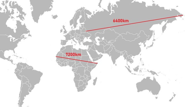
The Mercator world map
Examples of size distortion
Greenland appears the same size as Africa, when in reality Africa's area is 14 times as large.[13]
Greenland's real area is comparable to the Democratic Republic of the Congo's alone.
Africa appears to be roughly the same size as South America, when in reality Africa is over one and a half times as large.
Alaska appears to be the same size as Australia, although Australia is actually 4.5 times as large.
Alaska also takes as much area on the map as Brazil, whereas Brazil's area is nearly 5 times that of Alaska.
Madagascar and Great Britain look about the same size, while Madagascar is actually more than twice as large as Great Britain.
https://www.green.earth/blog/true-size-map-africa
from https://www.reddit.com/r/Africa/comments/1h8bwm3/a_map_comparing_actual_distances_to_their/?rdt=57762
https://www.reddit.com/r/interestingasfuck/comments/mtooia/the_mercator_projection_vs_the_actual_size_of/
and the new one
This Award Winning Map is the Most Accurate Picture of Earth Ever Created:
We've been viewing the world incorrectly for 500 years.
The traditional world map, first designed by Gerardus Mercator in 1569, has long been criticized for its significant distortions.
It exaggerates the size of regions in the northern hemisphere, such as Europe and North America, while diminishing those closer to the equator.
Greenland, for example, appears the size of Africa on many maps, despite being 14 times smaller.
In the 1970s, German journalist Arno Peters publicly denounced the Mercator projection, highlighting its role in perpetuating a Eurocentric worldview. Even modern alternatives often fail to accurately represent landmasses like Antarctica.
Now, Tokyo-based architect and artist Hajime Narukawa won Japan's prestigious Good Design Award for developing the AuthaGraph World Map, a groundbreaking projection that preserves the true proportions of continents and oceans.
By dividing the globe into 96 triangles, then transferring these to a tetrahedron and unfolding it into a rectangle, the AuthaGraph map eliminates the distortions found in both the Mercator and Dymaxion maps.
Remarkably, it also allows for seamless tiling, enabling users to reposition regions at the center while maintaining accurate geographical relationships.
The creators of the AuthaGraph map argue that, while traditional maps prioritized land, today’s global challenges demand a broader focus on oceans and polar regions. Issues such as melting glaciers, rising sea levels, and the territorial claims over marine resources require an accurate and unbiased representation of the Earth.
By offering a fresh perspective, the AuthaGraph map aims to help users better understand the interconnectedness of our planet's land and water systems. Imagine, too, how this innovative map could reshape our view of 600 million years of continental drift

